
Master Key Flutter Widgets with Children for Dynamic and Flexible UIs
A n overview of Flutter's versatile widgets categorized by core layout, scrolling behavior, dynamic functionality, menus, and advanced customizations. This guide includes popular widgets like Row, Column, ListView, SliverList, DropdownButton, and more, offering a comprehensive workflow for developers.
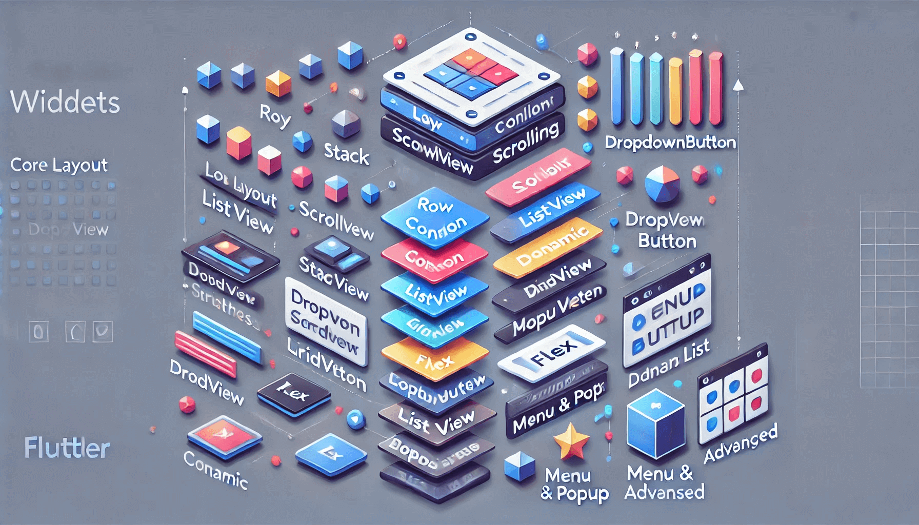
Core Layout Widgets with children
- Row - Arranges widgets horizontally.
Row(
children: [
Icon(Icons.star),
Text('Row Child 1'),
Text('Row Child 2'),
],
)- Column - Arranges widgets vertically.
Column(
children: [
Icon(Icons.star),
Text('Column Child 1'),
Text('Column Child 2'),
],
)- Stack - Overlaps widgets on top of each other.
Stack(
children: [
Container(color: Colors.blue, width: 100, height: 100),
Positioned(top: 10, left: 10, child: Icon(Icons.star)),
],
)- Wrap - Flows widgets horizontally and wraps to the next line.
Wrap(
children: [
Container(color: Colors.red, width: 50, height: 50),
Container(color: Colors.green, width: 50, height: 50),
Container(color: Colors.blue, width: 50, height: 50),
],
)- Flex - A general layout widget for flexible alignment.
Flex(
direction: Axis.vertical,
children: [
Text('Flexible Child 1'),
Text('Flexible Child 2'),
],
)Scrollable Widgets with children
- ListView - Scrollable list of widgets.
- GridView - Scrollable grid of widgets.
- PageView - Scrollable pages, but usually uses
childrenfor static content. - SingleChildScrollView (wraps one
childwidget, but nested widgets can containchildren).
Decorative or Structural Widgets
- Table - Arranges widgets in a table layout (rows and columns).
- IndexedStack - Displays only one child at a time but can contain multiple children.
- CustomScrollView - For creating custom scroll effects with multiple children via slivers.
Menu and Popup Widgets
- DropdownButton - Uses
itemsfor multiple options, which are widgets. - PopupMenuButton - Displays multiple
PopupMenuEntrywidgets.
Dynamic Widgets
- AnimatedList - Efficiently animates and manages a dynamic list of widgets.
- ReorderableListView - A scrollable list that allows reordering of its children.
Widget Groups with children
- DefaultTabController (via
TabBarView) - Holds multiple widgets for each tab. - Stepper - Contains multiple steps as children.
- NavigationRail - Uses
destinationsproperty, which takes a list of widgets.
Advanced and Custom Widgets
- SliverList - A sliver that displays a linear list of children.
- SliverGrid - A sliver that displays a grid of children.
- Flow - A highly customizable widget that arranges children dynamically.
- Builder Widgets (e.g.,
ListView.builder,GridView.builder,CustomScrollView) indirectly generatechildren.
Approximate Count
If we include core layout, scrolling, menus, and customizations:
- Core Flutter widgets with
children: Around 20–30 widgets. - Including custom use cases (e.g.,
Slivers,Builder Widgets): Over 40 widgets.
In Flutter, many widgets support thechildproperty, as it is the most common way to encapsulate and manage a single child widget. Below is a categorized list of key widgets with thechildproperty, followed by an approximate count.
Core Layout and Structural Widgets
- Container - Holds a single widget with styling options.
- Padding - Adds space around a single child.
- Center - Centers a child widget within its parent.
- Align - Aligns a child widget within its parent.
- Expanded - Expands the child to fill available space in a
Row,Column, orFlex. - Flexible - Similar to
Expanded, but with flexibility in sizing. - SizedBox - Constrains a child to specific dimensions.
- ConstrainedBox - Imposes additional constraints on a child widget.
- FittedBox - Scales and positions its child within itself.
Decorative Widgets
- ClipRRect - Clips its child with rounded corners.
- ClipOval - Clips its child in an oval shape.
- ClipPath - Clips its child using a custom path.
- DecoratedBox - Applies a decoration to its child.
- ShaderMask - Applies a shader to its child.
Interactive and Functional Widgets
- GestureDetector - Detects gestures on its child widget.
- InkWell - Adds ripple effects to its child.
- Hero - Creates a hero animation for its child.
- Tooltip - Displays a tooltip for its child.
Scroll Widgets
- SingleChildScrollView - Makes its child scrollable.
Input and Form Widgets
- Form - Groups form fields, accepting a single child (often a
Column). - ScrollView - Provides scrollable functionality for a single child.
- Focus - Adds focus capabilities to its child.
Custom or Advanced Widgets
- Builder - Provides a
BuildContextfor its child. - StreamBuilder - Builds itself based on the latest snapshot of interaction.
- FutureBuilder - Builds itself based on the result of a
Future.
Approximate Count
Flutter’s architecture uses the child property extensively. Most widgets that apply transformations, styling, alignment, or other modifications to another widget use child.
- Widgets with
child: Over 50 core widgets in Flutter. - Since Flutter encourages composition over inheritance, many custom widgets also use the
childproperty.
Summary of child vs children
child: Used for widgets that only manage a single widget.children: Used for widgets that manage multiple widgets.
Comprehensive List of Widgets with children
1. Core Layout Widgets
These widgets form the backbone of most Flutter layouts.
Row - Horizontal alignment of widgets.
Row(
children: [
Text('Row Child 1'),
Icon(Icons.star),
],
)
Column - Vertical alignment of widgets.
Column(
children: [
Text('Column Child 1'),
Icon(Icons.star),
],
)
Stack - Overlapping widgets.
Stack(
children: [
Container(color: Colors.blue, height: 100, width: 100),
Positioned(child: Icon(Icons.star), top: 10, left: 10),
],
)
Wrap - Widgets flow horizontally and wrap to the next line.
Wrap(
children: [
Container(color: Colors.red, width: 50, height: 50),
Container(color: Colors.blue, width: 50, height: 50),
],
)
Flex - Custom alignment for children.
Flex(
direction: Axis.horizontal,
children: [
Text('Flex Child 1'),
Text('Flex Child 2'),
],
)
GridView - A scrollable grid of widgets.
GridView.count(
crossAxisCount: 2,
children: [
Icon(Icons.star),
Icon(Icons.favorite),
],
)
Table - Arranges widgets in a table format.
Table(
children: [
TableRow(children: [Text('Cell 1'), Text('Cell 2')]),
TableRow(children: [Text('Cell 3'), Text('Cell 4')]),
],
)
ListView - Scrollable vertical list.
ListView(
children: [
Text('Item 1'),
Text('Item 2'),
],
)
2. Scrollable Widgets
Widgets that manage scrollable content with multiple children.
SingleChildScrollView - Makes its child scrollable.
SingleChildScrollView(
child: Column(
children: [
Text('Scrollable Child 1'),
Text('Scrollable Child 2'),
],
),
)
CustomScrollView - Provides custom scrolling effects with slivers.
CustomScrollView(
slivers: [
SliverList(
delegate: SliverChildListDelegate([
Text('Sliver Child 1'),
Text('Sliver Child 2'),
]),
),
],
)
SliverList - Creates a scrollable list in CustomScrollView.
SliverList(
delegate: SliverChildListDelegate([
Text('Sliver List Child 1'),
Text('Sliver List Child 2'),
]),
)
SliverGrid - Creates a scrollable grid in CustomScrollView.
SliverGrid(
delegate: SliverChildListDelegate([
Icon(Icons.star),
Icon(Icons.favorite),
]),
gridDelegate: SliverGridDelegateWithFixedCrossAxisCount(crossAxisCount: 2),
)
3. Interactive and Functional Widgets
These widgets enhance user interaction with multiple children.
Stepper - A step-by-step progress widget.
Stepper(
steps: [
Step(title: Text('Step 1'), content: Text('Details for Step 1')),
Step(title: Text('Step 2'), content: Text('Details for Step 2')),
],
)
ReorderableListView - Allows reordering of list items.
ReorderableListView(
onReorder: (oldIndex, newIndex) {},
children: [
ListTile(key: ValueKey(1), title: Text('Item 1')),
ListTile(key: ValueKey(2), title: Text('Item 2')),
],
)
DropdownButton - Select options from a dropdown.
DropdownButton<String>(
items: [
DropdownMenuItem(value: 'Option 1', child: Text('Option 1')),
DropdownMenuItem(value: 'Option 2', child: Text('Option 2')),
],
onChanged: (value) {},
)
PopupMenuButton - Displays a list of options in a popup.
PopupMenuButton<int>(
itemBuilder: (context) => [
PopupMenuItem(value: 1, child: Text('Option 1')),
PopupMenuItem(value: 2, child: Text('Option 2')),
],
)
4. Advanced Custom Widgets
Widgets for advanced or dynamic use cases.
AnimatedList - Efficiently animates list items.
AnimatedList(
initialItemCount: 2,
itemBuilder: (context, index, animation) {
return FadeTransition(
opacity: animation,
child: Text('Item $index'),
);
},
)
PageView - Enables swiping between pages.
PageView(
children: [
Text('Page 1'),
Text('Page 2'),
],
)
IndexedStack - Displays one child at a time, switching based on index.
IndexedStack(
index: 0,
children: [
Text('Child 1'),
Text('Child 2'),
],
)
NavigationRail - Sidebar for navigating between views.
NavigationRail(
destinations: [
NavigationRailDestination(icon: Icon(Icons.home), label: Text('Home')),
NavigationRailDestination(icon: Icon(Icons.settings), label: Text('Settings')),
],
)
Total Widgets
Core Widgets: 12–15 key widgets like Row, Column, Stack, etc.
Advanced/Custom Widgets: Over 10 additional widgets, including SliverList, AnimatedList, Stepper, etc.
This totals over 25–30 widgets that directly use the children property. Let me know if you need further elaboration!
1. Core Layout Widgets
These widgets are foundational layout widgets that use a single child.
Container
Container(
padding: EdgeInsets.all(8.0),
color: Colors.blue,
child: Text('This is a child of Container'),
)
Align
Align(
alignment: Alignment.center,
child: Text('This is aligned in the center'),
)
Center
Center(
child: Text('Centered Text'),
)
Padding
Padding(
padding: EdgeInsets.all(16.0),
child: Text('Padded Text'),
)
FittedBox
FittedBox(
child: Text('This text will resize to fit its parent'),
)
ConstrainedBox
ConstrainedBox(
constraints: BoxConstraints(
maxHeight: 200,
maxWidth: 200,
),
child: Container(
color: Colors.green,
height: 300,
width: 300,
),
)
FractionallySizedBox
FractionallySizedBox(
alignment: Alignment.center,
widthFactor: 0.5,
child: Container(
color: Colors.red,
height: 100,
),
)
SizedBox
SizedBox(
width: 100.0,
height: 100.0,
child: Container(
color: Colors.orange,
),
)
DecoratedBox
DecoratedBox(
decoration: BoxDecoration(color: Colors.blue),
child: Padding(
padding: EdgeInsets.all(16.0),
child: Text('Decorated Box'),
),
)
LimitedBox
LimitedBox(
maxHeight: 100.0,
maxWidth: 100.0,
child: Container(
color: Colors.yellow,
height: 200,
width: 200,
),
)
AbsorbPointer
AbsorbPointer(
absorbing: true,
child: GestureDetector(
onTap: () {
print('This will not be printed');
},
child: Container(
color: Colors.blue,
height: 100,
width: 100,
),
),
)
IgnorePointer
IgnorePointer(
ignoring: true,
child: GestureDetector(
onTap: () {
print('This will not be printed');
},
child: Container(
color: Colors.red,
height: 100,
width: 100,
),
),
)
AspectRatio
AspectRatio(
aspectRatio: 16 / 9,
child: Container(
color: Colors.pink,
),
)
Transform
Transform.rotate(
angle: 0.2,
child: Container(
color: Colors.green,
width: 100,
height: 100,
),
)
ClipRRect
ClipRRect(
borderRadius: BorderRadius.circular(16),
child: Image.network('https://example.com/image.jpg'),
)
Opacity
Opacity(
opacity: 0.5,
child: Text('This text is 50% opaque'),
)
2. Interactive Widgets
Widgets that allow interactions or provide functionality on a single child.
InkWell
InkWell(
onTap: () {
print('InkWell tapped');
},
child: Container(
color: Colors.blue,
padding: EdgeInsets.all(16.0),
child: Text('Tap me!'),
),
)
GestureDetector
GestureDetector(
onTap: () {
print('GestureDetector tapped');
},
child: Container(
color: Colors.green,
padding: EdgeInsets.all(16.0),
child: Text('Tap me!'),
),
)
Hero
Hero(
tag: 'hero-tag',
child: Material(
color: Colors.transparent,
child: Container(
height: 200,
width: 200,
color: Colors.blue,
),
),
)
Dismissible
Dismissible(
key: Key('item1'),
onDismissed: (direction) {
print('Item dismissed');
},
child: ListTile(title: Text('Swipe me')),
)
Draggable
Draggable(
child: Container(
color: Colors.orange,
width: 100,
height: 100,
),
feedback: Material(
color: Colors.transparent,
child: Container(
color: Colors.blue,
width: 100,
height: 100,
),
),
)
LongPressDraggable
LongPressDraggable(
child: Container(
color: Colors.green,
width: 100,
height: 100,
),
feedback: Material(
color: Colors.transparent,
child: Container(
color: Colors.purple,
width: 100,
height: 100,
),
),
)
MouseRegion
MouseRegion(
onEnter: (_) => print('Mouse entered'),
onExit: (_) => print('Mouse exited'),
child: Container(
color: Colors.red,
height: 100,
width: 100,
),
)
Listener
Listener(
onPointerDown: (_) => print('Pointer down'),
child: Container(
color: Colors.blue,
height: 100,
width: 100,
),
)
RawKeyboardListener
RawKeyboardListener(
focusNode: FocusNode(),
onKey: (event) {
print('Key pressed');
},
child: Container(
color: Colors.yellow,
height: 100,
width: 100,
),
)
3. Animation Widgets
Widgets designed for animating a single child.
AnimatedContainer
AnimatedContainer(
duration: Duration(seconds: 1),
color: Colors.blue,
width: 200,
height: 200,
child: Center(child: Text('Animated!')),
)
AnimatedOpacity
AnimatedOpacity(
opacity: 0.5,
duration: Duration(seconds: 2),
child: Text('This will fade out'),
)
AnimatedCrossFade
AnimatedCrossFade(
firstChild: Container(
color: Colors.blue,
width: 100,
height: 100,
),
secondChild: Container(
color: Colors.red,
width: 100,
height: 100,
),
crossFadeState: CrossFadeState.showFirst,
duration: Duration(seconds: 2),
)
AnimatedBuilder
AnimatedBuilder(
animation: AnimationController(vsync: this, duration: Duration(seconds: 1)),
builder: (context, child) {
return Transform.rotate(
angle: animation.value,
child: child,
);
},
child: Container(
color: Colors.green,
height: 100,
width: 100,
),
)
FadeTransition
FadeTransition(
opacity: animation,
child: Container(
color: Colors.blue,
width: 100,
height: 100,
),
)
ScaleTransition
ScaleTransition(
scale: animation,
child: Container(
color: Colors.orange,
width: 100,
height: 100,
),
)
SlideTransition
SlideTransition(
position: animation,
child: Container(
color: Colors.red,
width: 100,
height: 100,
),
)
RotationTransition
RotationTransition(
turns: animation,
child: Container(
color: Colors.purple,
width: 100,
height: 100,
),
)
SizeTransition
SizeTransition(
sizeFactor: animation,
child: Container(
color: Colors.green,
height: 100,
width: 100,
),
)
PositionedTransition
PositionedTransition(
rect: animation,
child: Container(
color: Colors.yellow,
width: 100,
height: 100,
),
)
TweenAnimationBuilder
TweenAnimationBuilder(
tween: Tween(begin: 0.0, end: 1.0),
duration: Duration(seconds: 2),
builder: (context, value, child) {
return Opacity(
opacity: value,
child: child,
);
},
child: Container(
color: Colors.blue,
width: 100,
height: 100,
),
)
4. Scrolling Widgets
Widgets that are scrollable but use a single child for their content.
SingleChildScrollView
SingleChildScrollView(
child: Column(
children: List.generate(20, (index) {
return Text('Item $index');
}),
),
)
ListTile
ListTile(
title: Text('List Tile Item'),
subtitle: Text('Subtitle'),
onTap: () {
print('List tile tapped');
},
)
GridTile
GridTile(
child: Container(
color: Colors.blue,
height: 100,
width: 100,
),
)
5. Platform-Specific Widgets
Widgets designed for platform-specific UI or navigation.
MaterialPageRoute
Navigator.push(
context,
MaterialPageRoute(builder: (context) => SecondScreen()),
)
CupertinoPageScaffold
CupertinoPageScaffold(
navigationBar: CupertinoNavigationBar(
middle: Text('Cupertino Page'),
),
child: Center(child: Text('Content goes here')),
)
CupertinoNavigationBar
CupertinoNavigationBar(
middle: Text('Cupertino Navigation Bar'),
)
CupertinoTabScaffold
CupertinoTabScaffold(
tabBar: CupertinoTabBar(
items: [
BottomNavigationBarItem(
icon: Icon(CupertinoIcons.home),
label: 'Home',
),
BottomNavigationBarItem(
icon: Icon(CupertinoIcons.settings),
label: 'Settings',
),
],
),
tabBuilder: (context, index) {
return Center(child: Text('Tab $index'));
},
)
6. Widgets for Text
Widgets that manage text rendering.
Text
Text('This is some text')
RichText
RichText(
text: TextSpan(
children: [
TextSpan(text: 'This is normal text. '),
TextSpan(
text: 'This is bold text.',
style: TextStyle(fontWeight: FontWeight.bold),
),
],
),
)
DefaultTextStyle
DefaultTextStyle(
style: TextStyle(color: Colors.green),
child: Column(
children: [
Text('This is green text'),
Text('This is also green text'),
],
),
)
TextFormField
TextFormField(
decoration: InputDecoration(labelText: 'Enter text'),
)
7. Input Widgets
Widgets for form input.
TextFormField
TextFormField(
decoration: InputDecoration(labelText: 'Enter something'),
validator: (value) {
if (value == null || value.isEmpty) {
return 'Please enter some text';
}
return null;
},
)
Form
Form(
key: _formKey,
child: Column(
children: <Widget>[
TextFormField(
decoration: InputDecoration(labelText: 'Enter text'),
),
ElevatedButton(
onPressed: () {
if (_formKey.currentState!.validate()) {
// Process data
}
},
child: Text('Submit'),
),
],
),
)
FormField
FormField(
initialValue: 'Initial Value',
builder: (state) {
return TextFormField(
decoration: InputDecoration(labelText: 'Field'),
);
},
)
8. Miscellaneous Widgets
Various other tasks.
CustomPaint
CustomPaint(
size: Size(100, 100),
painter: MyPainter(),
)
FutureBuilder
FutureBuilder<String>(
future: fetchData(),
builder: (context, snapshot) {
if (snapshot.connectionState == ConnectionState.waiting) {
return CircularProgressIndicator();
} else if (snapshot.hasError) {
return Text('Error: ${snapshot.error}');
} else {
return Text('Data: ${snapshot.data}');
}
},
)
StreamBuilder
StreamBuilder<int>(
stream: myStream(),
builder: (context, snapshot) {
if (snapshot.connectionState == ConnectionState.waiting) {
return CircularProgressIndicator();
}
return Text('Stream value: ${snapshot.data}');
},
)
ErrorWidget
ErrorWidget('Something went wrong');
ValueListenableBuilder
ValueListenableBuilder<int>(
valueListenable: myValueListenable,
builder: (context, value, child) {
return Text('Value: $value');
},
)
Builder
Builder(
builder: (context) {
return Text('This is built lazily!');
},
)
9. Custom Widgets
Custom widgets built using StatelessWidget or StatefulWidget often use the child property.
CustomWidget
class CustomWidget extends StatelessWidget {
final Widget child;
CustomWidget({required this.child});
@override
Widget build(BuildContext context) {
return Container(
color: Colors.grey,
child: child,
);
}
}
CustomButton
class CustomButton extends StatelessWidget {
final Widget child;
final VoidCallback onPressed;
CustomButton({required this.child, required this.onPressed});
@override
Widget build(BuildContext context) {
return ElevatedButton(
onPressed: onPressed,
child: child,
);
}
}
These examples should help you understand how to use each of these widgets with a child in Flutter.
Leave a Comment
Video

0 Comments